About this template
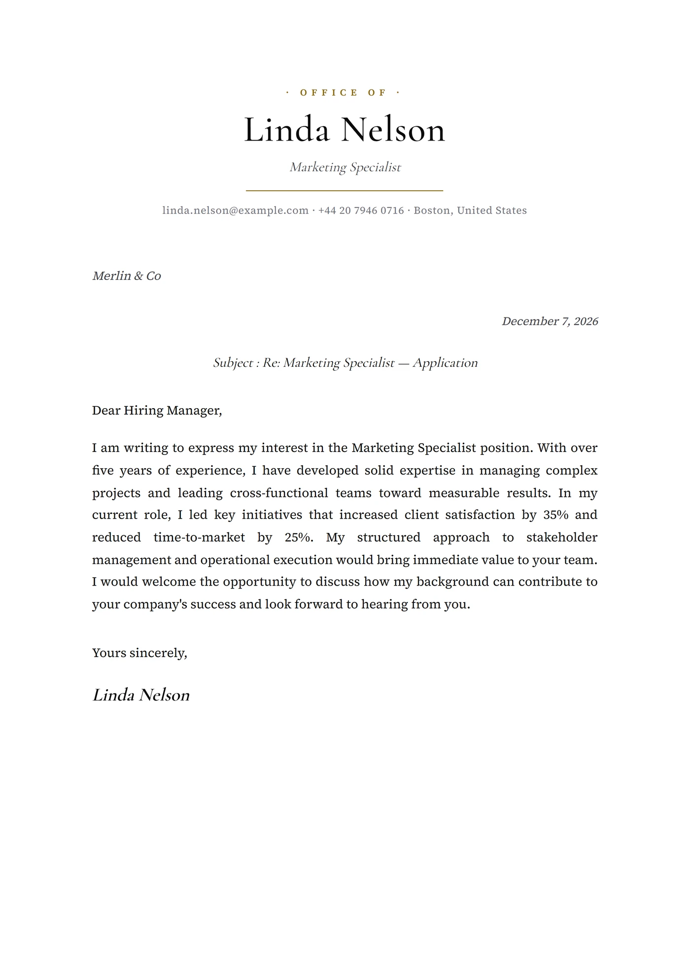
The Art Nouveau template is a floral cover letter set in Cormorant Garamond with whiplash vine motifs framing the header, sage-green ink on ivory paper and a monogrammed drop cap — the visual code of Mucha posters translated into business correspondence. The letter signals a classical training and a sensibility to the decorative arts without sliding into pastiche: the ornament follows a strict proportional grid and the body remains perfectly readable. It is a message addressed to an identified recipient, never a file pushed through an automated HR portal.
Who is it for?
It fits applicants in artisanal floristry (Putnam & Putnam New York, Flora Starkey London, McQueens Flowers), niche perfumery (Le Labo, Frédéric Malle US, Aedes de Venustas), fine bookbinding, heritage hospitality (Belmond properties, Glasgow Grand Central, the Plaza Athénée), vintage interior design and classical theatrical scenography. It suits creative directors, fine craftspeople, scenographers, master bookbinders and floral stylists who want to signal arts-school training — clearly inappropriate for finance, tech, SaaS B2B or any pipeline filtered by Greenhouse or Workday.
How to use it
Use the drop cap to open on a concrete fact ('Putnam & Putnam entrusted me with the 2024 Met Gala arrangements') rather than a generic formula. Sage green reads as a personal signature — keep it consistent across your CV. For applications to Anglo-Belgian houses (Brussels, Glasgow, Bruges), a regional subtitle on the second line can reinforce the heritage signal. Keep the letter to a single page. If you send it as an email attachment, export to PDF with embedded fonts — Cormorant Garamond is not universally installed and substitution kills the typographic case for the 'art nouveau cover letter design' search you want to win.
Frequently asked questions
Does sage-green ink print well on standard office printers?
On 120gsm matte ivory paper, yes — that is the rendering for which the template was calibrated. On standard machine white, the green can read paler and lose depth. For a print-out at a recruitment firm (where the printer is a standard office device), keep the PDF as is: the chosen hue stays legible even from a budget laser. For premium hand-delivery, ask a print shop for laid paper and a calibrated print profile.
Is it suitable for an application to an art school?
Yes for Parsons, RISD, the Royal College of Art, Pratt Institute and SAIC, where the Art Nouveau grammar is read as a manifesto of visual culture. For design-engineering schools (Olin, Northwestern engineering design), choose a more contemporary template. The rule of thumb: Art Nouveau speaks to schools that claim a craft heritage, not to programs that pitch themselves on STEM rigour.
Is a specific envelope needed for this type of letter?
For physical delivery (a competition, an industry fair, an agency pitch), yes: cream laid paper, lined envelope, optional wax seal for the most traditional houses. For digital delivery, the PDF quality matters more than the envelope — export at 300 DPI, embed the fonts, avoid image compression that would degrade the vines. The wax-seal version only makes sense for files you know will be physically opened.