About this template
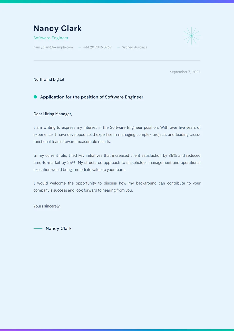
The Terracotta Earth template is a cover letter with a saturated terracotta-red accent on the header rule and signature — the most assertive variant of the earth-tone family. The off-white background and the neutral sans-serif body preserve the minimal sobriety while adding a strong chromatic signal, a design tailored to creative and media applications that own their identity, and parses cleanly through every editorial and cultural-institution ATS.
Who is it for?
It suits creative and media candidates applying to lifestyle magazines with a warm positioning (Apartamento, Cabana, The Gentlewoman, Cereal, Kinfolk, Monocle), cultural-communications agencies (Bureau Betak, Pitch&Sync, Boat Rocker Media), contemporary-art foundations (Whitney, MoMA PS1, Tate Modern, Serpentine, Hauser & Wirth) and design-led publishers (Phaidon, Taschen, Gestalten). Equally relevant for art-direction profiles in lifestyle fashion, branding studios with a craft slant and editorial design houses.
How to use it
The saturated terracotta (around #C5563C) is intentionally assertive — that is the very argument of the template. Do not soften the colour, do not swap it for a gentler accent: you would lose the contrast with the off-white background that does the work. For an application that owns its creativity without falling into rainbow palettes, this is the right template. Two paragraphs of substantive argument, with the colour carrying the personality signal.
Frequently asked questions
What is the difference with the Sandstone Warm template?
Sandstone Warm has a beige-sand background and a terracotta accent — the template is more monochromatic and regional. Terracotta Earth has an off-white background and a saturated terracotta accent — the contrast is stronger and the effect more assertive. Choose Terracotta Earth to signal a creative personality, Sandstone Warm to signal a regional anchor.
Is it suitable for press applications?
Yes, particularly for lifestyle, design and culture magazines (Apartamento, Cabana, The Gentlewoman, Kinfolk, Monocle, The New York Times Magazine, The New Yorker culture desk). For traditional daily press (The Wall Street Journal, Financial Times, The Times), prefer Minimal Monochrome, which fits the conventions of newsroom recruitment better than the saturated register.
Does the saturated terracotta clear ATS systems?
Yes. Standard ATS systems (Workday, Greenhouse, Lever, BambooHR) parse text without considering colour. The PDF embeds the terracotta via CSS rendering and preserves OCR legibility. The chromatic saturation has no impact on keyword extraction — every word reaches the human reviewer intact, regardless of the visual register chosen.