About this template
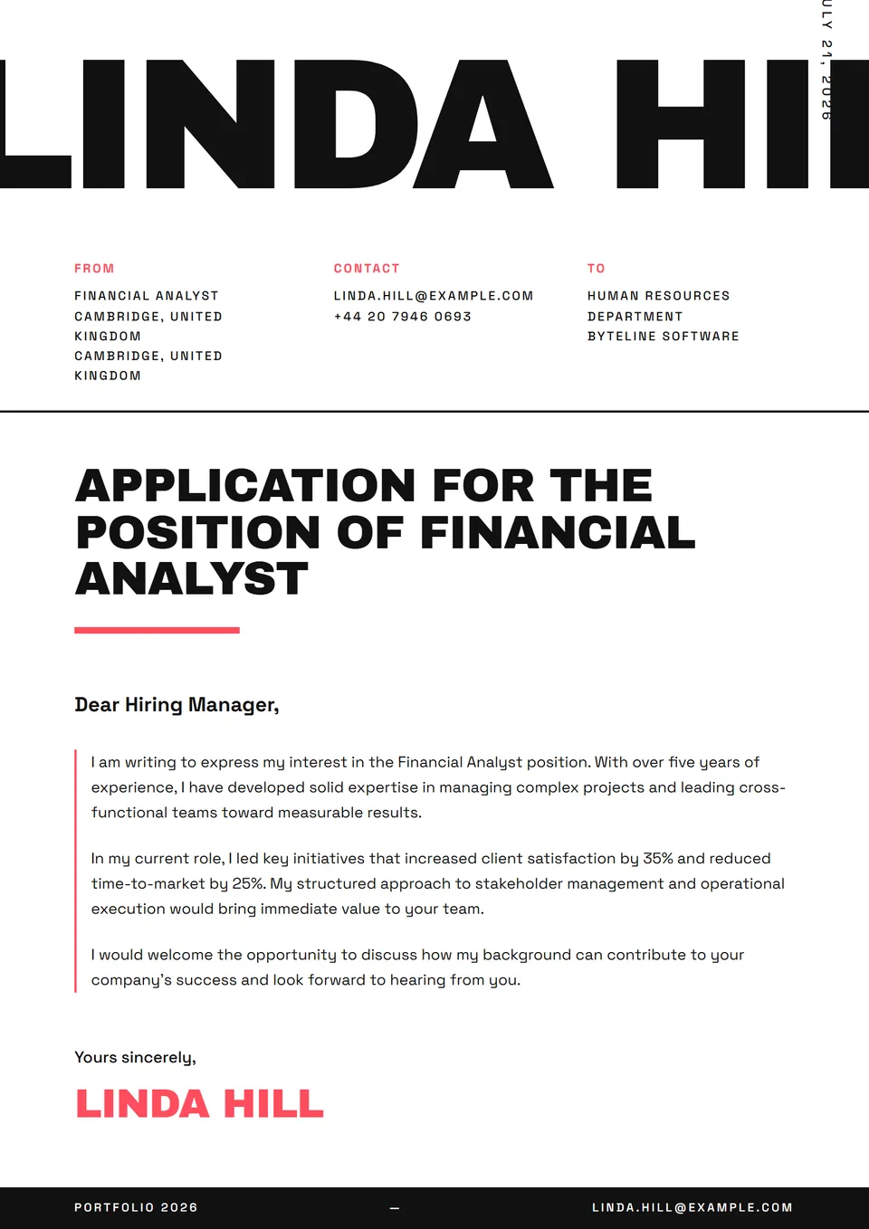
The Asymmetric Bold template is a cover letter with an off-axis layout — name set bold flush-left above a tight black accent, with a Söhne body shifted right. Heavy headings, airy body — a contrast that reads like a miniature graphic poster. It parses through modern ATS (Greenhouse, Lever, Ashby) cleanly; the asymmetry is purely visual.
Who is it for?
It suits art directors, senior graphic designers, type-sensitive product designers and creative directors applying to studios (Pentagram, Mucca, Sagmeister & Walsh, Mother), magazines (The New York Times Magazine, Wired, AnOther, AD), fashion houses (Calvin Klein, Khaite, Bode, The Row) and consumer brands with strong identity (Glossier, Aesop, Aimé Leon Dore). Counter to classic corporate codes — the typographic stance is the message.
How to use it
The typographic stance demands an owned candidate voice — no empty formulas. Open with a sentence that defines your angle ("I work typography as material, not as a tool"). Cite two or three flagship projects with brand, editorial scope and year. For a magazine application, mention your layout training (Yale Graphic Design MFA, Cooper Union, Werkplaats Typografie, RCA) and a publication where you've signed a master layout. The opening sentence carries more weight than the whole second paragraph.
Frequently asked questions
Does the right-shifted layout pass corporate ATS?
Yes. The asymmetric layout is purely visual: Workday, Greenhouse and Lever extract clean linear text. For an application at a large publisher (Condé Nast, Hearst, Penguin Random House) or a luxury house (LVMH, Kering), the asymmetry reads as a graphic-culture signal — not a technical flaw.
Does it suit a speculative application to Pentagram or Mucca?
Yes, provided your portfolio matches the letter's visual promise. An asymmetric letter with no photographed, high-resolution projects feels hollow. Prepare three recent pieces (identity, magazine, packaging) well-documented before sending — legendary studios read the portfolio before the letter, not after.
Should I include a handwritten signature?
For this template, yes — the handwritten signature adds a human note to the cold graphic stance. Scan at high resolution (600 dpi, transparent or pure-white background) and place it below the closing. Avoid auto-generated Outlook signatures: they're immediately recognisable and undermine the considered stance the rest of the letter sets up.