About this template
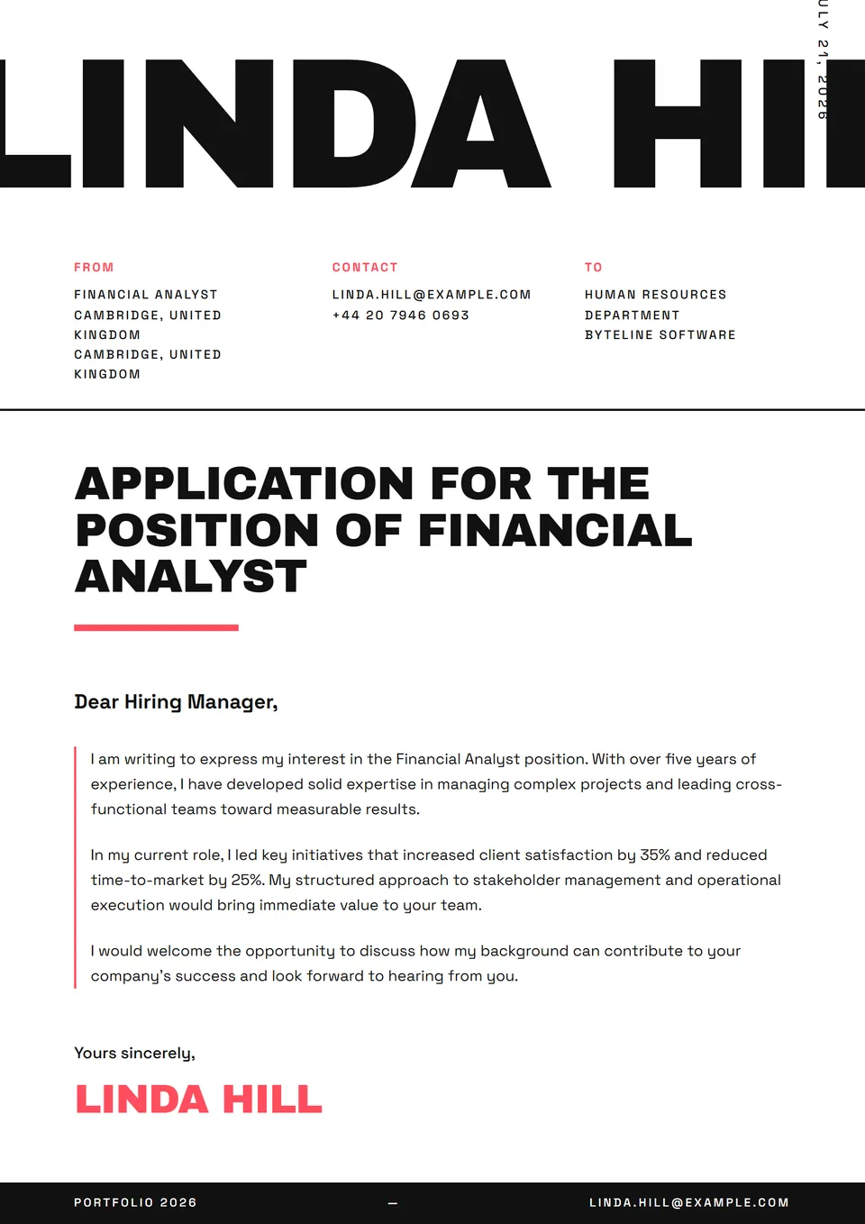
The Brutalist Raw template is a high-conviction cover letter with thick black rules, a monospace body and hammered all-caps headers. No gradients, no soft corners — just typographic blocks on bare paper, the aesthetic of Wim Crouwel posters and independent fanzines. It parses cleanly through text-extracting ATS (Greenhouse, Lever) because the heavy rules are visual and never enter the text flow.
Who is it for?
It suits independent designers, art directors at creative agencies (Wieden+Kennedy, Mother NY, Pentagram, BBDO indie cells), type designers at foundries (Production Type, Commercial Type, Klim Type), indie music labels, contemporary architecture studios (Adjaye, Diller Scofidio + Renfro independent track) and agencies that openly claim graphic radicality. Avoid it categorically for banking, legal, medical or public-sector applications — the read is immediately disqualifying.
How to use it
The brutalist stance must extend into the writing: short sentences, action verbs, no ornate salutations. Open with a hard fact ("18 identity systems shipped in two years for brands featured in It's Nice That and Eye Magazine."). Refuse marketing superlatives. If the named recipient is Michael Bierut, Paula Scher or another recognised figure, write to them by name — never "Dear Hiring Manager" when the studio is small enough to know who reads inbox mail.
Frequently asked questions
Is a brutalist letter suitable for any creative agency?
No. Brutalism is a signature: it works at studios that openly claim a radical aesthetic (foundries, indie design studios, alternative agencies). At a holding-company agency with Fortune 500 clients, the code reads as provocative. Study the agency's last three Cannes Lions or D&AD entries before submitting.
Can I use it for a speculative application?
Yes — it's the most natural format. A cold submission to a studio you follow demands an owned stance. Cite three recent studio pieces (a campaign, an identity, an exhibition) before arguing your contribution. The letter becomes a short personal manifesto, not a rote application.
How do I balance brutalist visuals with readability?
Hold the reading grid: tight margins, clear typographic hierarchy (11pt body minimum), no more than two weights. Brutalism is not chaos — it's visual discipline. An unreadable letter gets binned without being read, regardless of how cult the studio is. Crouwel was meticulous; copy that meticulousness, not just the visual aggression.