About this template
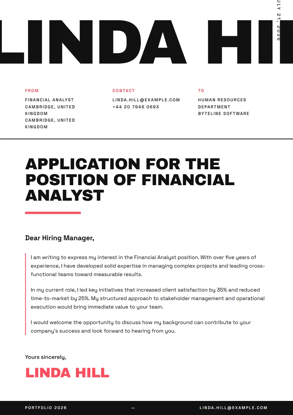
The Swiss Grid template is a modern cover letter in the discipline of Swiss style — Helvetica end-to-end, flush-left body, one-pixel rules and a 12-column grid that organises every paragraph. A single red accent, dominant white — Müller-Brockmann, Hofmann and Lohse's visual grammar applied to A4 or US Letter. It parses universally through all ATS (Workday, Greenhouse, Lever, Ashby, SAP) because grid rigour aligns with single-column parsing.
Who is it for?
It suits senior designers, brand strategists, editorial directors, type-fluent product managers and consultants applying to design-conscious organisations. Strong fit for premium brands (Aesop, Bang & Olufsen, Hermès design studio, Hay), cultural institutions (MoMA, Tate, Centre Pompidou, Pinault Collection), editorial media (The New Yorker, The Atlantic, NYT, M Le Magazine) and agencies with modernist Swiss heritage.
How to use it
Swiss style demands perfect discipline: no decorative bold, no colour other than the red accent, equal margins. The body must be as rigorous as the layout — simple sentences, factual structure (context / action / outcome), no superlatives. Cite the graphic references you carry (Basel School, Yale Graphic Design, Werkplaats Typografie) and the brands where you've signed a layout system. For an editorial direction, mention circulation and frequency of titles led.
Frequently asked questions
Is Swiss style too rigid for a consumer brand?
On the contrary — Swiss rigour is a recognised premium code, signalling graphic maturity and the ability to hold a system over time. For demanding D2C brands (Glossier, Aesop, Mejuri, Tediber), the code works very well. For fast-fashion or strongly narrative brands, the code reads as distant: prefer Aurora Purple or Asymmetric Bold.
Must I use Helvetica?
Helvetica is the historical Swiss-style signature — replacing it with Inter or Söhne reads as an acceptable contemporary concession. Avoid Arial (Microsoft's lower-quality substitute), which immediately degrades the read for a design recruiter. If Helvetica isn't licensed, Neue Haas Grotesk Display is a faithful alternative — never settle for system defaults.
Does it suit a strategy consulting application?
Very well. Swiss style is the visual code closest to the asceticism McKinsey, BCG, Bain, Oliver Wyman and Roland Berger expect. Strict grid, white-red-black palette and systematic typography signal intellectual rigour. Prefer Platinum Edge if you're aiming at Senior Partner or Managing Director level.